The original card design
Cameron and I were sitting in a bubble tea cafe doing a bit of Food Coma play-testing with the first real draft of our playing cards.
The cards had a lot of information on them. Here’s an original sketch of how we designed the cards to look:

That’s when Cameron said, “What if each of these cards had a joke tagline under the ingredient name?”
My first reaction was ‘No way, that’s crazy!’ Real estate on the cards was already limited; they’d be overloaded with information. Besides, we wouldn’t want to distract from the game play. This idea could never work.
So I said, “Let’s try it and see.”
Rewind a couple months…
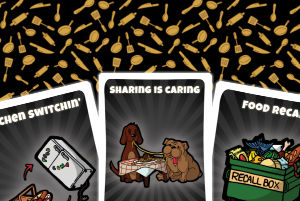
When we were first coming up with card ideas, we had the concept locked down: A party game that involves feeding other players until they pass out in a food coma.
We determined the ingredient types: flour, sugar, egg, protein and vegetable. And we had done play-testing with decks of playing cards and a sharpie.

Then we started thinking about the visuals on each card.
One of our guiding principles was to design a game that was fun and interesting. So we resisted using typical ingredients.
We saw an opportunity to have ingredients that were ridiculous and punny. The T-Rex T-Bone steak was one of the first ingredients we came up with.

We liked the T-Rex idea and kept thinking along those lines. Before we knew it, we had dozens of ingredient ideas. Here are a few of the original ingredient drawings:

Evolution of the card design
The early card design was good, but not great. At first, the cards had the ingredient symbol on both the top and bottom, as well as a store icon.
That’s when Cameron had the idea of adding a tag line, which pushed us to re-think and improve our design. So we removed the letter on the bottom and moved the store icon to the back of the card.
This opened up the bottom of the card to make room for the tagline.

We also changed the card’s dimensions from Blackjack size (63mm x 88mm) to Bridge size (57mm x 87mm) to give the cards a sleeker feel.
The complete card experience
Adding a tagline not only helped us refine and improve the ingredient cards, but also aligned with our goal of making a fun party game. It pushed the playing cards to be something that people could enjoy before the game even started, providing something interesting to look at while adding depth to the ingredients.
Each individual card reflects the craft and dedication we’ve put into every aspect of the game.

Our play testers confirmed how much they enjoyed the cards’ jokes, and the ingredient image, name and tagline combination all helped the game’s look and feel to come together.
The ingredient cards’ inspired decisions for Food Coma’s playable characters’ design, which you can read about in this post.
If you enjoyed reading about the thoughts and processes that went into designing Food Coma, support our Kickstarter!